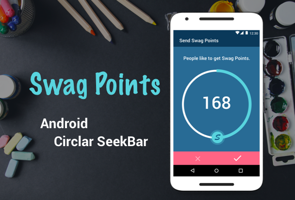
Today I’m going to create an android custom view to implement circular SeekBar like the mockup below, make it as a library, open source at GitHub, and publish it to JCenter. In this post, I will cover several fundamental concepts of android custom view, write a helpful README on GitHub, and how to publish your library.
Before you start…
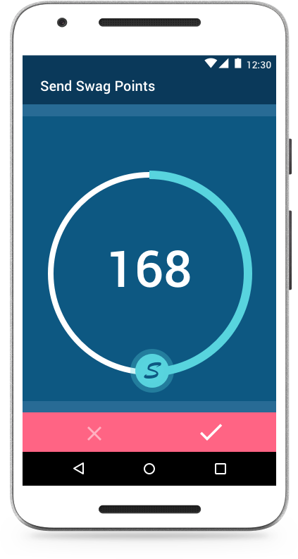
Try to understand the requirement or design specification, take a look at this widget first, the user can touch the indicator icon through this arc to set the current progress level. The indicator icon will stop dragging when exceeding max or min progress. It works like an extension of circular SeekBar with customized appearances and motion event.
Get started:
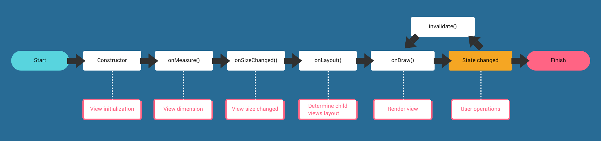
All the android view widgets are based on View, to implement custom view, you will start a subclass of View and override several lifecycle callback methods of view, so you need to understand the view lifecycle at first. The following diagram shows some important methods to override:
To get started, the first thing we have to do is to create a class that extends View, and provide two default constructors which allows us to create the view programmatically (1st constructor) or in XML layout (2nd constructor). The SwagPoint(Context context, AttributeSet attrs) constructor is more important here because it is used when Android inflates the view from XML layout file, otherwise you will get exception.
1 2 3 4 5 6 7 8 9 10 11 12 13 | |
Then, there are several things we have to control or modify in our custom view:
Attributes: What things are customizable in your view? Determine custom attributes that allow developer to change its appearance and behavior in XML layout file according to their design.
Size: Determine the dimensions of the view and every components in this custom view on the screen.
Drawing: Determine how the view and components to render on the screen which contains the shape, location, appearance.
Touch: Determine the way the user can interact with the view by touching.
1. Attribute:
Here we provide several customizable attributes for developer: the initial progress points, the range of progress max/min, the interval when user change the progress step, the color and size of progress/arc/text. To define custom attributes, we create res/values/attrs.xml file and define custom attributes for your view in a <declare-styleable> resource element as below.
1 2 3 4 5 6 7 8 9 10 11 12 13 14 15 16 17 18 19 20 21 22 23 24 | |
After adding res/values/attrs.xml file, to use TypedArray to retrieve attribute value in class and define instance variables (the following variable with m as prefix name) to store. Here we add a init() method to put init() inside the constructor after super() method to do this job:
1 2 3 4 5 6 7 8 9 10 11 12 13 14 15 16 17 18 19 20 21 22 23 24 25 26 27 28 29 30 31 32 33 34 35 36 37 38 39 40 41 42 43 44 45 46 47 48 | |
2. Size:
In order to control the view dimension, we have to override View.onMeasure() method and calculate the size of each components. Here we have to define the arc radius according to the width/height of our view.
1 2 3 4 5 6 7 8 9 10 11 12 13 14 15 16 17 18 19 | |
3. Drawing:
Give you a pen and a paper, you can draw what you want. To draw the view, you have to override the onDraw(Canvas canvas) method.
Before that, we have to know what to draw and how to draw. Android provides two classes to do this job:
What to draw, handled by
Canvaswhich is provided as parameter inonDraw()method.How to draw, handled by
Paint.
Before you use Canvas to draw anything, it’s necessary to create Paint objects. For performance optimization, creating the Paint objects ahead is quite important, because the onDraw() method is called when redrawn is needed at anytime, we won’t create the Paint objects inside the onDraw() method, we should avoid any allocation in onDraw() method. Here we define these objects (one for arc, another for progress and the other for text) as instance variables and initialize at init() method:
1 2 3 4 5 6 7 8 9 10 11 12 13 14 15 16 17 18 19 20 21 | |
Once we have Paint objects defined, we can start to implement the onDraw(Canvas canvas) method, here we’re going to draw the text to display current progress number, the arc and current progress:
1 2 3 4 5 6 7 8 9 10 11 12 13 14 15 16 17 18 19 20 21 22 23 24 | |
After overriding onDraw() method, there is one more important method about drawing to introduce: invalidate(), this method is used when any redrawing is needed, we won’t call onDraw() directly, we just call this method instead, you can use this method anywhere inside your custom view, however, for performance optimization, make sure it’s called as infrequently as possible.
4. Touching:
When the user touch the screen, Android calls the onTouchEvent() method, so we override View.onTouchEvent() to handle the user input gestures:
1 2 3 4 5 6 7 8 9 10 11 12 13 14 15 16 17 18 19 20 21 22 23 24 25 26 27 28 29 30 31 | |
There are several things we have to control when user touches the indicator or other place of view:
Update the indicator icon position and progress text.
Draw the current progress on the arc.
Stop when reaching max or min.
To know the indicator icon position and the current progress to draw, we have to convert the touch coordinate on the screen to the angle of arc.
In our custom view, we consider the center of arc as origin (0, 0), and use trigonometric functions to transform the touch coordinate into the angle of the arc in degree (0, 360), and map to the current progress value of given range (min, max).
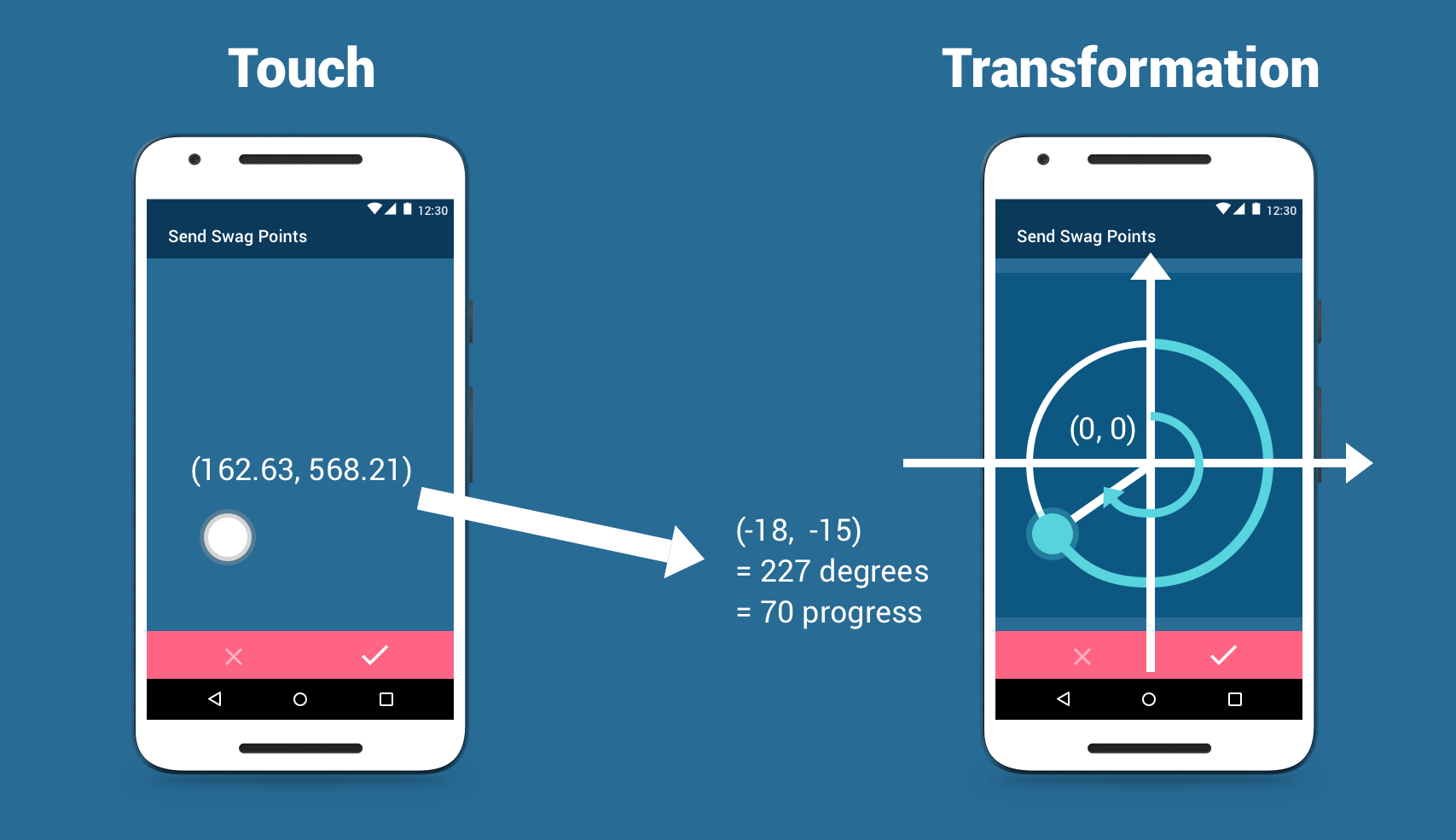
Here we have a method to convert from touch coordinate to the arc angle:
1 2 3 4 5 6 7 8 9 10 | |
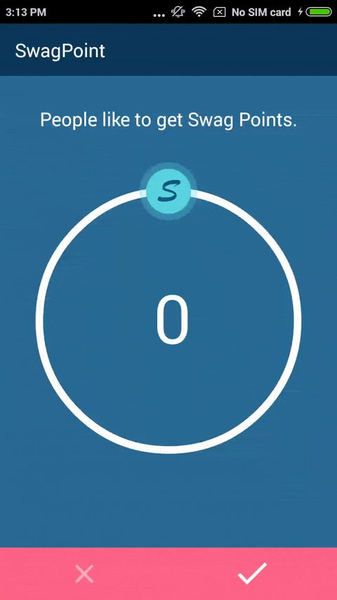
Final demo
Open source at GitHub:
So you just finish a android custom view project, great! Let’s put on GitHub to get more developers to use you project. However, before you share your GitHub link to others, just make sure you have a nice document first. When developers are looking at you project, there are some points they care about:
Does this project fit my requirement or solve my problem?
If the answer is YES, how can I get starting right now?
A nice document is like a salesman for you project. The README plays this important role to give the first impression to the developers who are looking at your project, so providing a well-documented README is necessary and gives you more chance to promote you project.
Knowing how to write a REAME is equivalently important to write a clean code or design a great architecture.
1. Provide a screenshot and short description:
A picture is worth a thousand words, especially in a UI widget project, make sure that you provide a photo, GIF or video with a short description to demonstrate how your UI looks like or works. (If you are familiar with some design software, i.e. Sketch or PhotoShop, try to use them to help you make a great cover with the screenshot for your project)
Give easy installation/usage instruction
Before using you project, developer have to install it first, make sure to give a clean and easy installation instruction to get started. After installing you project successfully, just give some example code snippet to show what your project does, and how the developers can customize what they want, maybe just give a list of customizable attributes or provide an APK to install or sample module to run.
Publish your library:
After finish pushing your project to GitHub, there is the last step to get done: publish it so that developers can just add dependency
1 2 3 4 | |
to use you project. Here we go:
1. Sign-up or sign-in at JFrog Bintray.
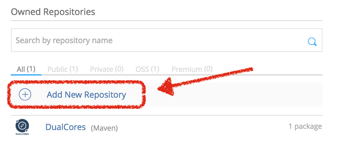
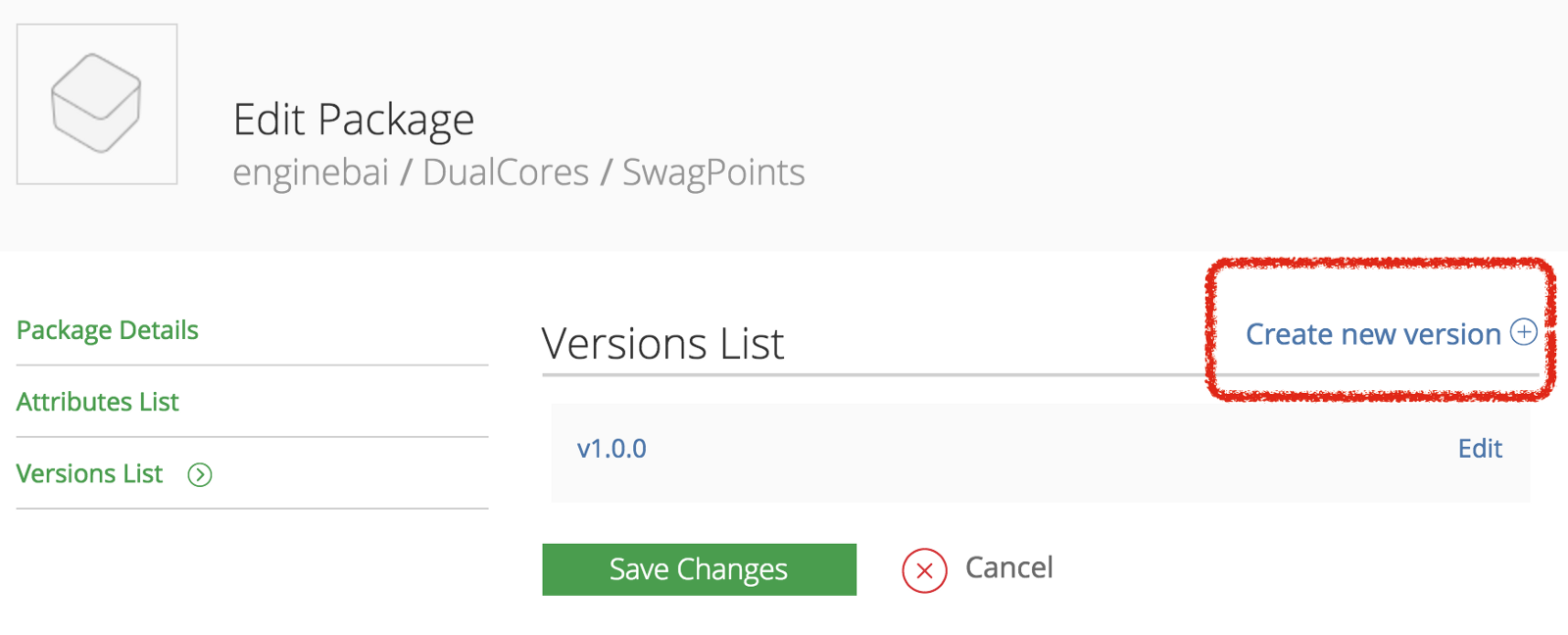
2. Go to profile page to create a repository, package, and version:
The repository is the place to host your several projects. You can choose any repository name whatever you want, it doesn’t matter for other developers.
Inside the new repository, you can create a package, that is place to host your project. Your project also can import from GitHub.
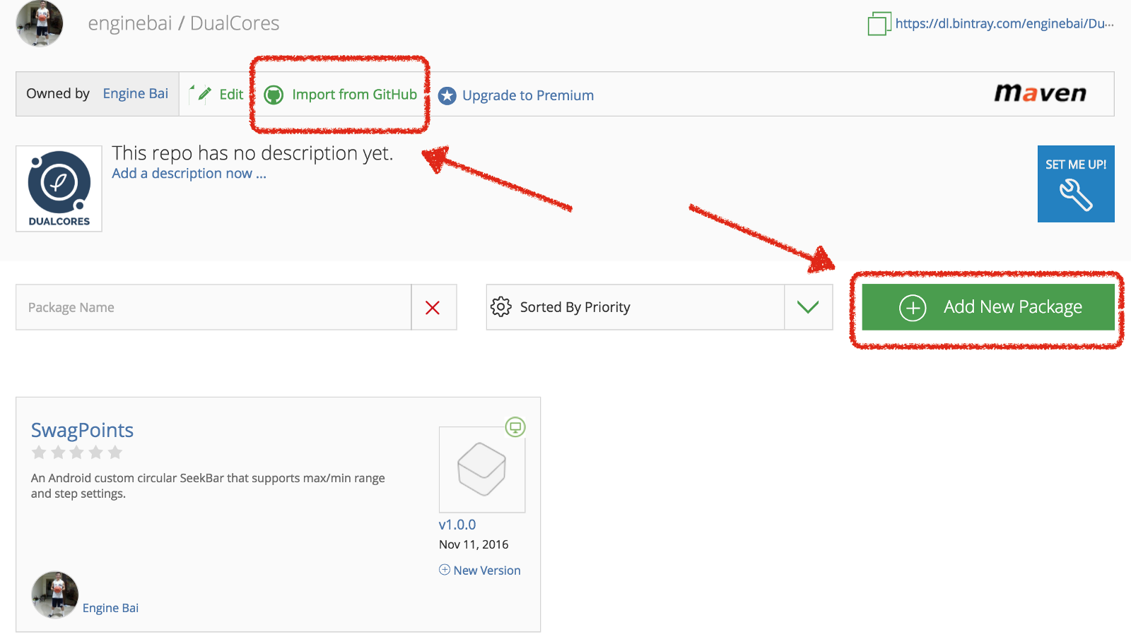
For each package, you can create several versions, again, you can choose whatever name you want, not restricted to the traditional version number major.minor.patch rule.
3. Generate and upload the aar files:
We use gradle to do this job, here I use this library to help https://github.com/blundell/release-android-library. Open you library module gradle file, add the following code snippet to buttom of module build.gradle file:
1 2 | |
and JCenter configuration:
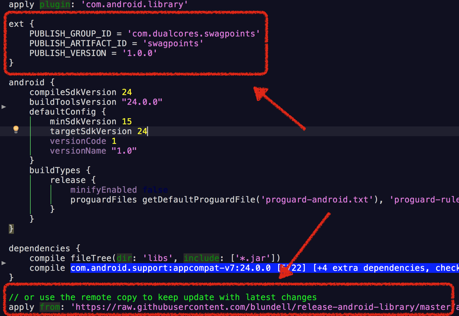
then, sync your project and open your terminal, go to your project root path, execute the command:
1
| |
If success, you will see the result in you terminal and you can upload the zip file from PROJECT_ROOT/library/build/release/1.0.0/:

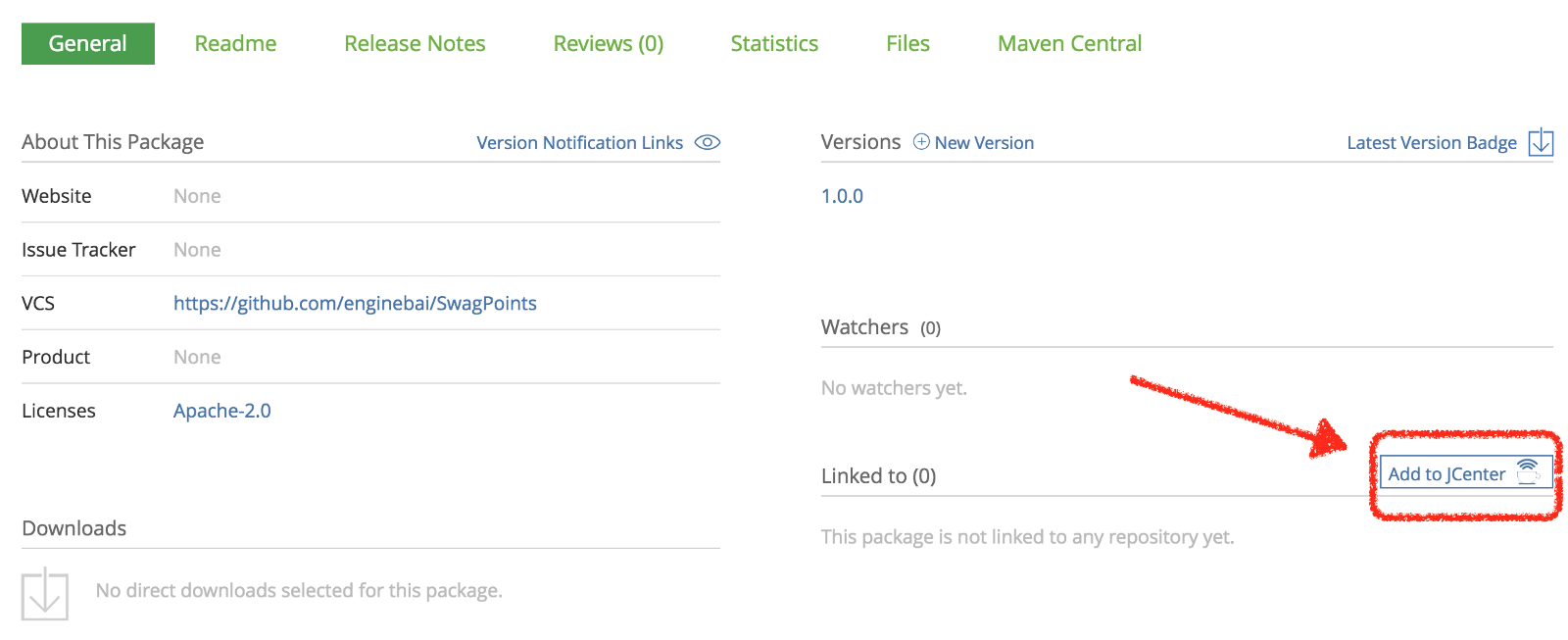
4. Add to JCenter:
Go back to your project page in bintray, there will be a Add to JCenter button in right-hand column, just click it to fill out a message and wait to be accepted. It takes hours or several days to be accepted, just be patient. This step is required so that to make your project downloadable and discoverable by gradle dependencies.
5. Project is accepted and test if everything is all right:
You will receive an email to inform you that your Add to JCenter request is accepted.Once it is accepted, test if gradle dependency works well by adding the dependency to sample module and sync. If it builds successfully, congratulation!!!! You’ve done. Good job~
1
| |